Colours in kitchen are an instant attraction. Arrivae speaks to expert to give you inputs on tips to use the right combination of bright colours in such a way that it does not overpower the rest of the space.
Client Expectation: Bright colour scheme for the kitchen.
Uniquely Yours Solution: Used red and white colour scheme to deck up the kitchen.
Architect Ashish Vaidya
What was the colour scheme used in the kitchen?
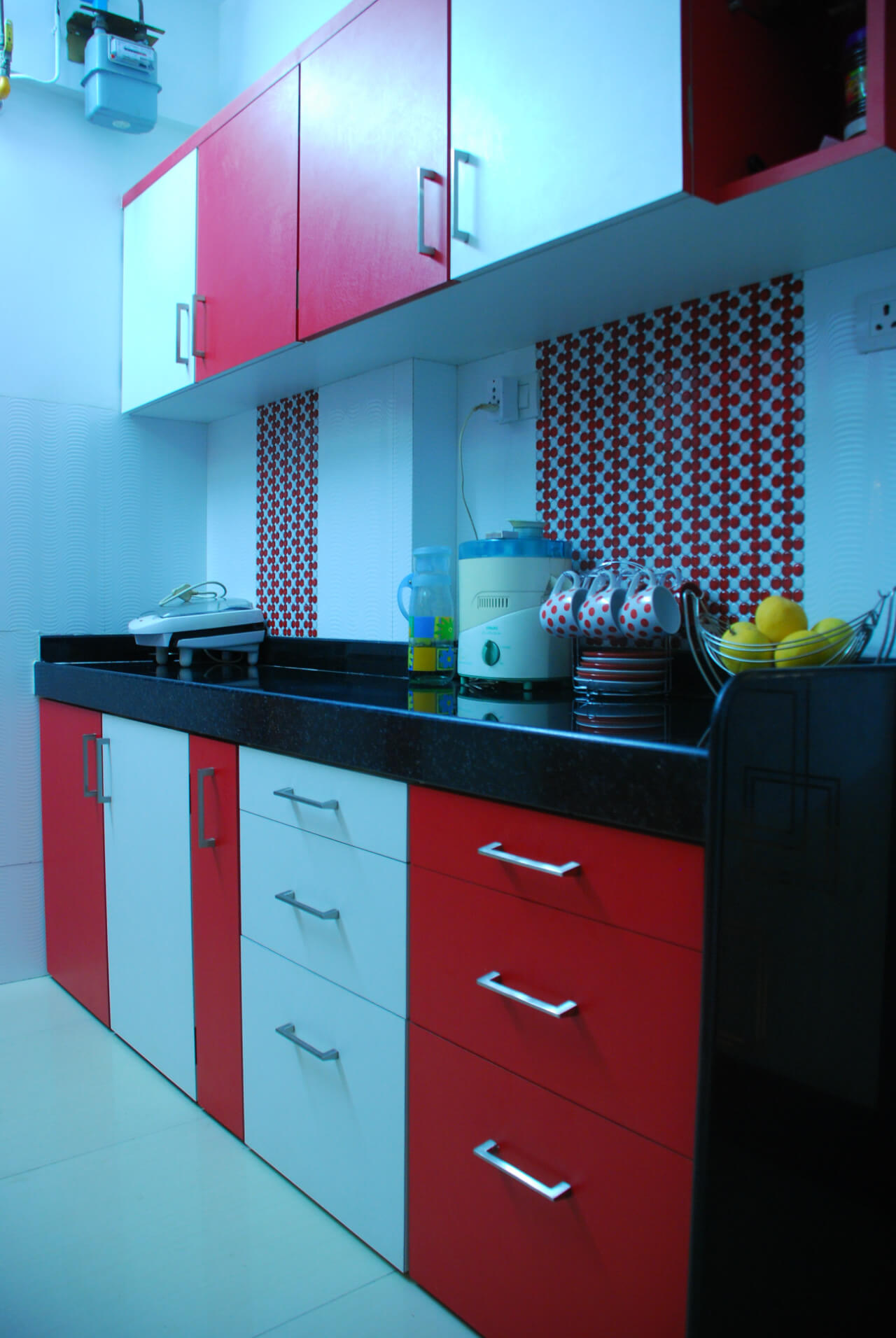
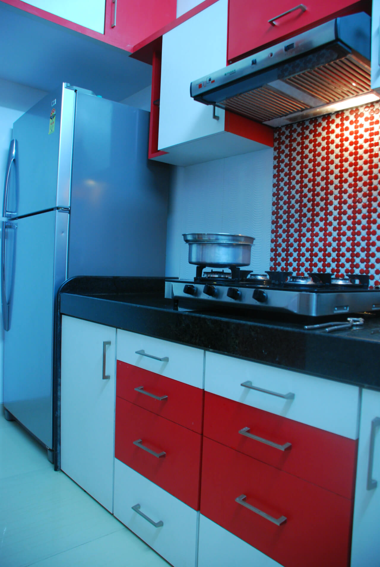
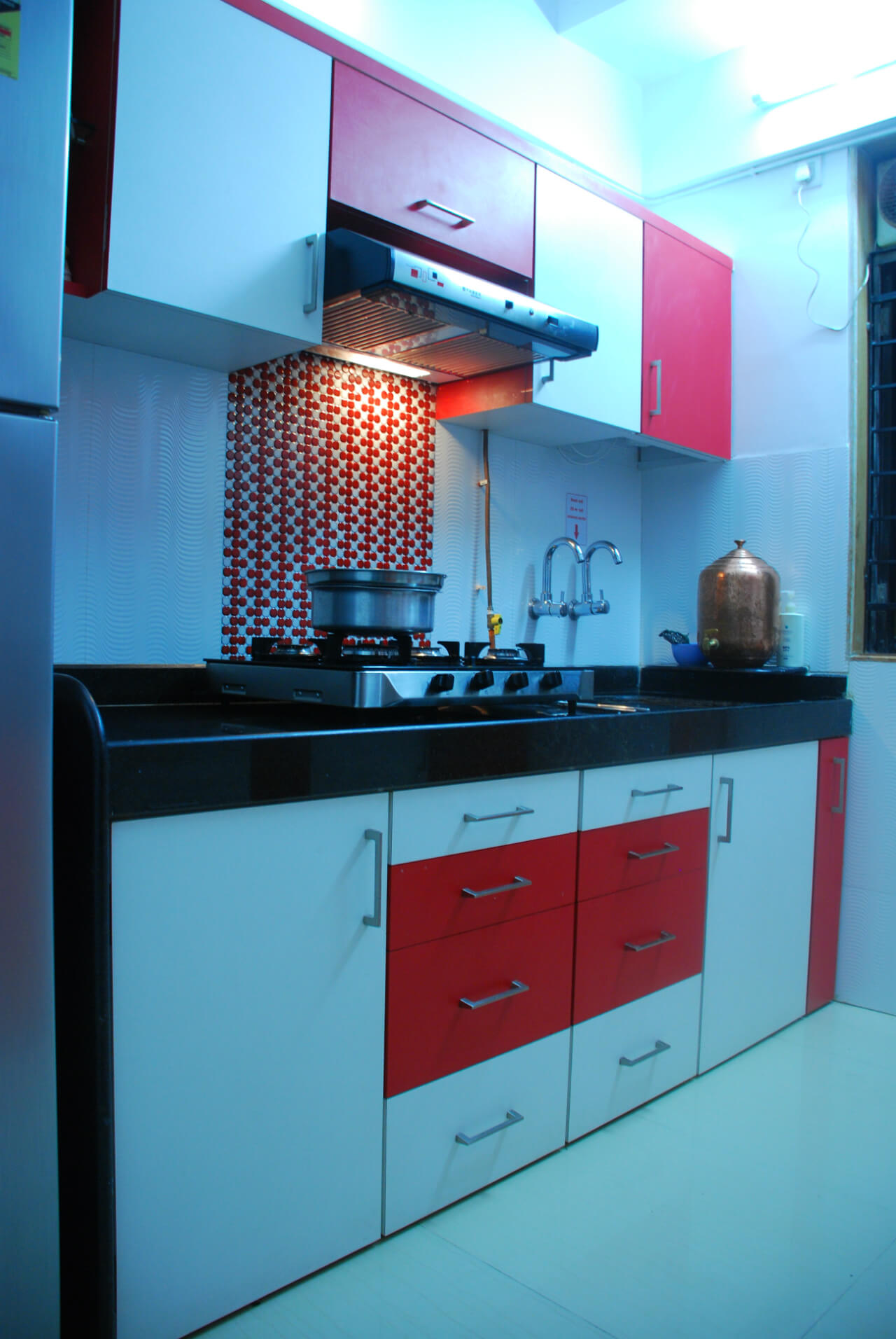
White and red was the main colour scheme in the kitchen. The entire house was decked up with this colour scheme and was extended to the kitchen area as well. The red and white combination gives a timeless and fresh twist to the space. Used alternately, the colour scheme on the storage space adds drama to the kitchen. It also gives the kitchen a unique character. As the kitchen space was small and compact, the bright colour scheme looks visually interesting.

How did you give a matching effect to the kitchen?
Laminate in red perfectly complements and highlights the red and white theme used in the kitchen. Red colour adds dynamism and gives it a charming and interesting touch to the kitchen.

What was the flooring concept used?
We used white ceramic anti-skid flooring to complement the colourful kitchen and reiterate the safety aspect that is very important as the user movement is maximum in the kitchen.

How did you create storage in the compact space?
Since the kitchen was small, we have used heavy storage and ductless chimney. The countertop was already done in black granite and therefore there was no changes done to it.

