Offices are getting styled in different ways utilizing available resources. Arrivae interacts with expert to emphasize on the convenience aspect that comes with the recycling feature.
Client Expectation: Toprawala Pvt. Ltd. had a lot of old furniture and wanted to use them effectively in the office. Desired to accommodate workstation area, server room, electrical and ups room, big conference room, MD and VP cabin, HR and accounts room cabins and 2 small meeting rooms in the 2,000 sq. ft. area office.
Uniquely Yours Solution: Made optimum use of old furniture and refurbished it to be utilized in the office.
Designer Makrand Dalvi
Did the client have any specific demand to be catered to in the office?
Toprawala Pvt. Ltd. desired to use old furniture and add new furniture only if required. Keeping this requirement in mind, for the 2,000 sq. ft. office area, we ensured to use old furniture as much as possible that was already available with the client. The storages and workstation were created with old furniture. Since the client had old branding, we refurbished the workstation with new branding. Most of the old furniture was refurbished including the workstation table that was created with a single soft board panel in such a way that both sides of the table could be utilized. We worked with stock furniture throughout and reused them wherever possible in such a way that it could blend well with the overall office space. In one of the cabins, we also used old wooden rafters on one side of the wall.
How did you uplift the office space to give it a unique look and feel?
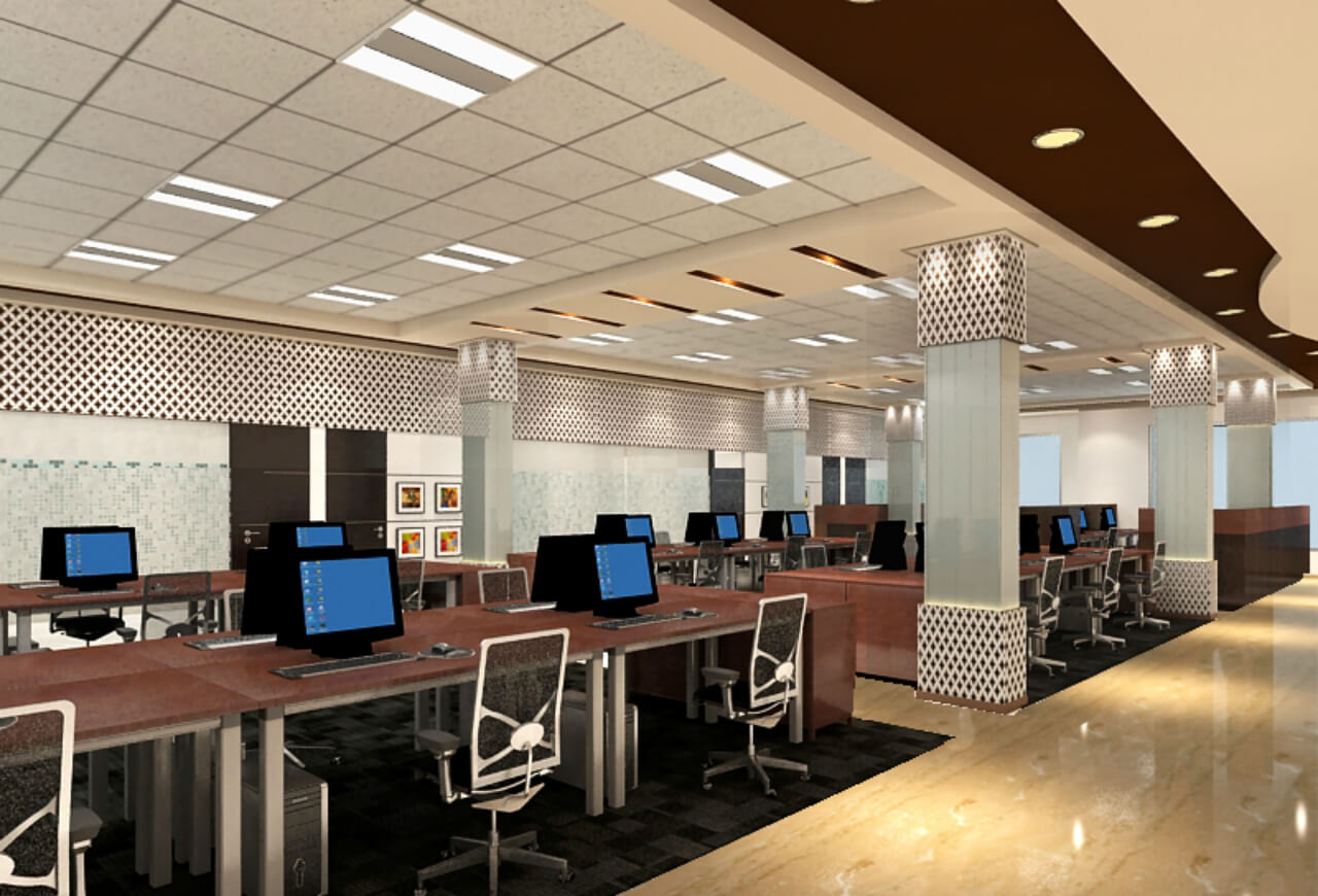
The server room was modified again with no change in location and we reused the false flooring to uplift it. For flexibility reasons, we combined the MD’s cabin and conference room to ensure the MD didn’t have to move to a different cabin to conduct a conference. Initially the reception area had just one meeting room. The main highlight of the whole area was to design the column that came up in the workstation area and is completely exposed. We cladded the columns with back-painted glass (reused glass) on the column and illuminated it with the help of LED lights. The outcome is it gives a subtle reflection throughout the space. We also created Indian jali patterns in MDF and painted it with desired colours. This highlighted the dead walls and partitions. The reception area was quite big. Initially we had only one meeting but we managed to split it into two, creating four seater meeting rooms. The inconvenience caused by frequent visitors was taken care of as they could accommodate these meeting rooms once they enter the office.
Give us details on the design feature of the VP’s room?
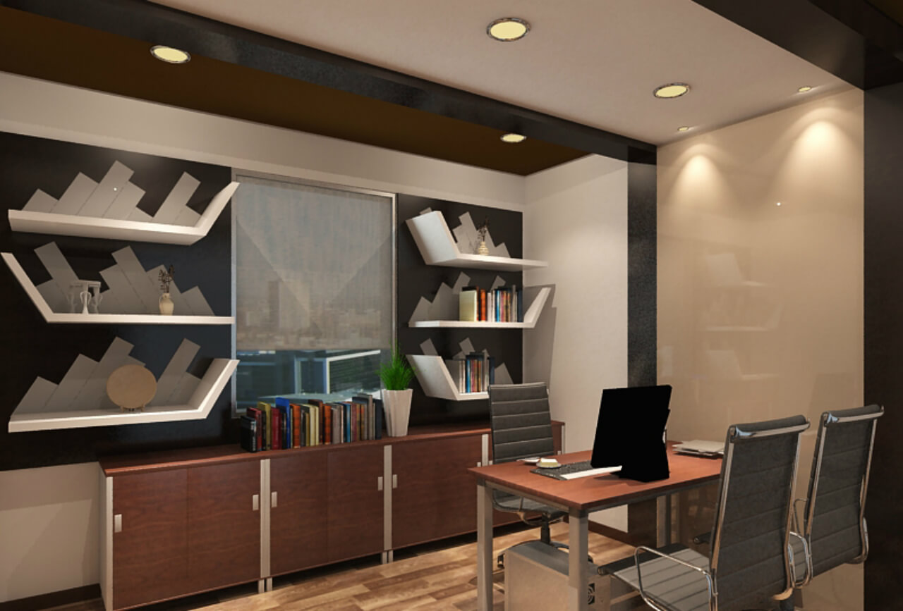
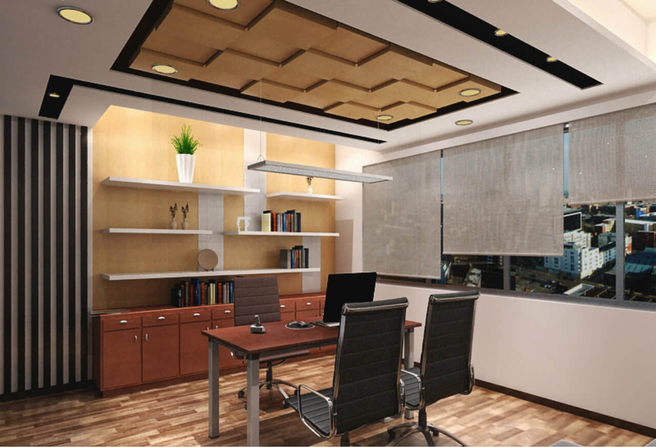
The VP’s room adorns a subtle look and feel. To enhance the cabin further and blend function with form, we created a back-painted glass for one of the walls with old furniture. This could be used to write notes during meetings and discussions. It also gives the space a clutter free appearance. Beige and white colour scheme used here complements the subtle touch that surrounds the cabin. Apart from these features, we added hardware and changed the laminate to match the overall décor of the VP room. We also created niches in the ceiling and highlighted it with lights. The ceiling was done in tow levels with dark and light colours on the back wall with zigzag pattern shelf and the flooring had a wooden touch.
How did you execute the design in the MD’s cabin?
To add a natural touch to the MD’s cabin, we used wooden flooring and decked it up with Duco paint and rafters on either side. Wallpaper was added on the backside. To add a decorative touch to the space, the ceiling above the seating area was done in wooden texture. We used white and dark brown colour scheme for the wooden flooring. The ceiling was decorated with slits and checkers pattern and we also played with levels. Additionally, we used old wooden rafters and painted with Duco paint and added shelves with nice wallpaper at the back to emphasize the cantilever shelves.
Tell us about the décor used in the office?
Vitrified flooring has been used apart from the workstation area that has carpet. The ceiling is simple and has 2/2 grid. Niches were created near the passage area for lights that has been highlighted with brown shades to match the veneer furniture in the office. For the workstation area, we used 2/2 grid ceiling and for the passage area, we created slits in the ceiling. To uplift the passage area, we used light brown colour and accentuated it with lights inside it. We also used jali on column and partitions to highlight the space.
How did you accentuate the conference room and back office?
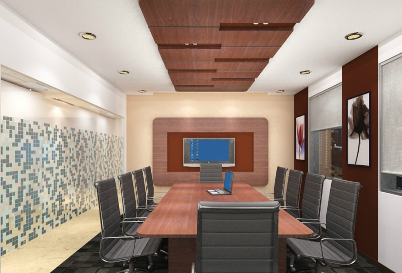
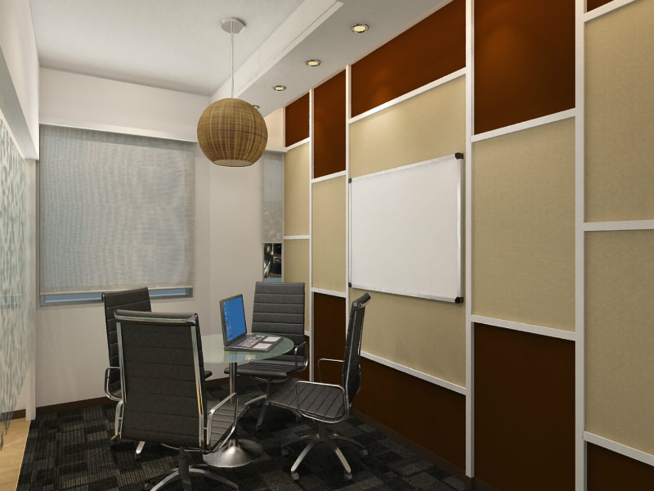
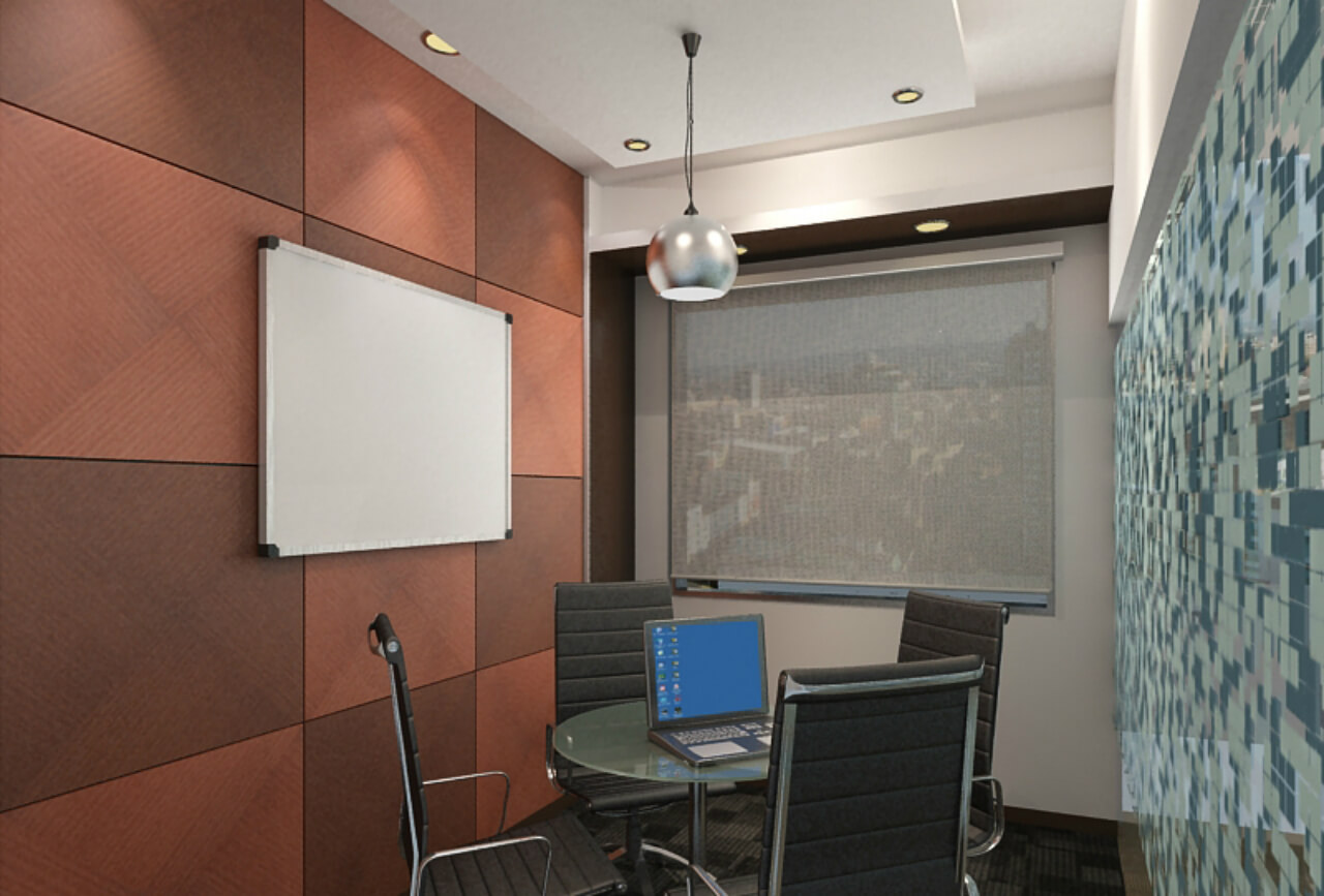
For the conference room, we used old soft board and combined it with a single panel and stuck it on the wall. This worked as a design element. Another interesting aspect of this feature is that both the sides can be utilized. To reiterate the recycle feature and take it to another level, we made use of old furniture again. For the big conference room, we made a table in such a way that can be split into two parts or could be converted into a single table that can be used for meetings. Other décor elements were wooden ceiling with groove in it, LCD panel with same veneer and back painted with colour that has been used in the ceiling to show resemblance in wall and ceiling. Two small 4 seater meeting rooms were created out of these one room partition with veneer panels and other side room partition was made with colour pattern.
For the back office in combination with new hardware, columns were decked up in white paint. To reuse the back-painted glass that the client already had, we put it on the column to get a groove effect. Lights added on top and bottom gives an illuminated feel to the space. To enhance the space further, we added jali to the upper part of the partition glass that was touching the ceiling between the cabin and the workstation.
How did you decorate the reception area?
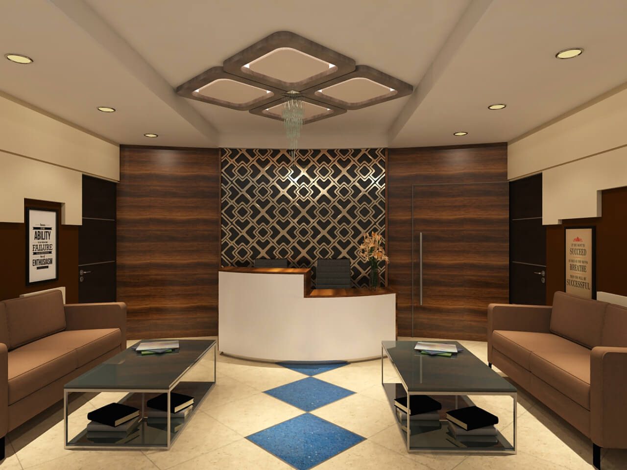
We created a pattern on the floor tiles with SS inlay and also highlighted the same pattern on the ceiling and finished it with silver leafing. The same design pattern has been repeated on the back panels of the reception area. The gold metallic colour enhances the look of the wall giving it a royal appearance with level differences paneling coloured with beige and brown colour. The reception back panel was also decked up with ebony veneer that is continued on the ceiling where the ceiling drop is given. Besides, the reception table has been refurbished with the old one. We also added frames with inspirational quotes on the walls.
What was the client’s reaction to the final outcome?
The client was amazed at the way a lot of old furniture was incorporated into the new design. He was happy with the design elements we provided within the given area like the planning of overall space. Toprawala appreciated the design elements that we added to make the workstation area more interesting. We managed to add accounts and HR departments and two more area. Overall, the client was appreciative of the design elements added to the office space. The client appreciated the fact that old furniture was accommodated into the space in different forms. Initially there was just one meeting room. We were able to create two meeting rooms and removed the partition to give a spacious look and feel to the office. The seating arrangement was also enhanced to accommodate more staff. Toprawala Pvt. Ltd. couldn’t have asked for anything more.
