Spaces with extravagant designs exude a unique style statement. Arrivae gets in touch with expert to find out different ways to help you add a touch of luxury to interiors.
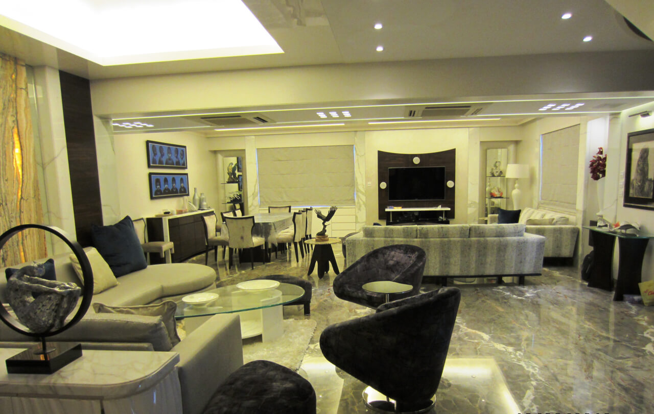
Client Expectation: Client in South Mumbai wanted a contemporary as well as classy design for his duplex apart from segregated areas for professional purpose and welcoming space for the family.
Uniquely Yours Solution: Executed the project with design that portrayed an original concept and customized furniture.
Roshni Sawant
What were the different requirements to be catered to in this project?
To begin with, the client was very particular about having areas segregated for different purpose. Another aspect that he wanted us to take care of in this project was to create the design and furniture from scratch to get the original look. Separate spaces were allocated for the waiting, seating area for the family and the dining.
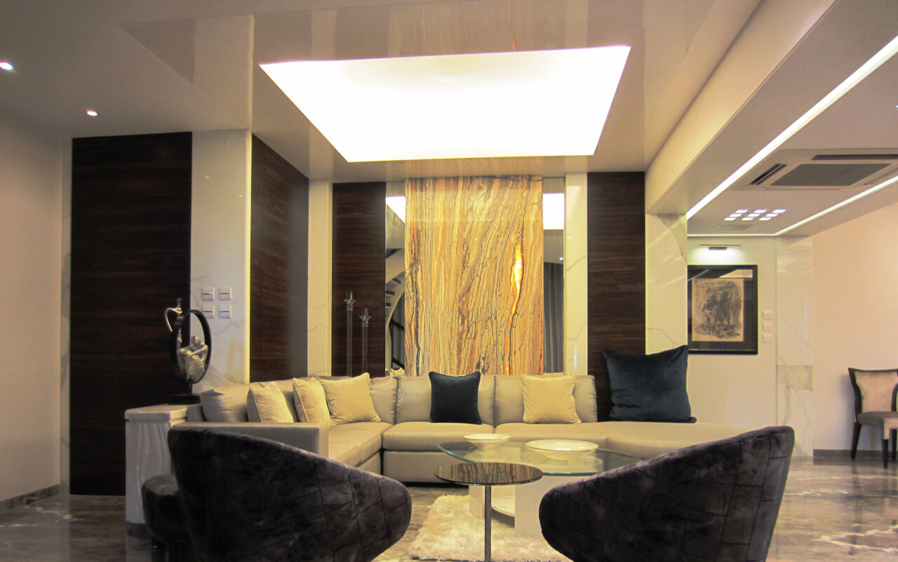
Tell us about the colour scheme used.
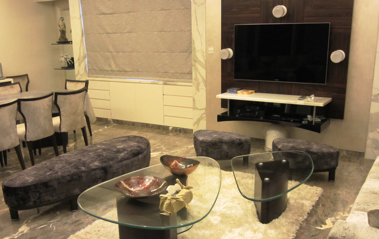
As the client desired a neutral touch to the space, we used a combination of ivory, grey with a little bit of brown in the living area. To add an element of luxury, onxy marble was used for wall panelling in the waiting area and Italian marble for the flooring. Suede and leather furnishings gave a decorative touch to the space.
How did you manage to give a different touch to the space?
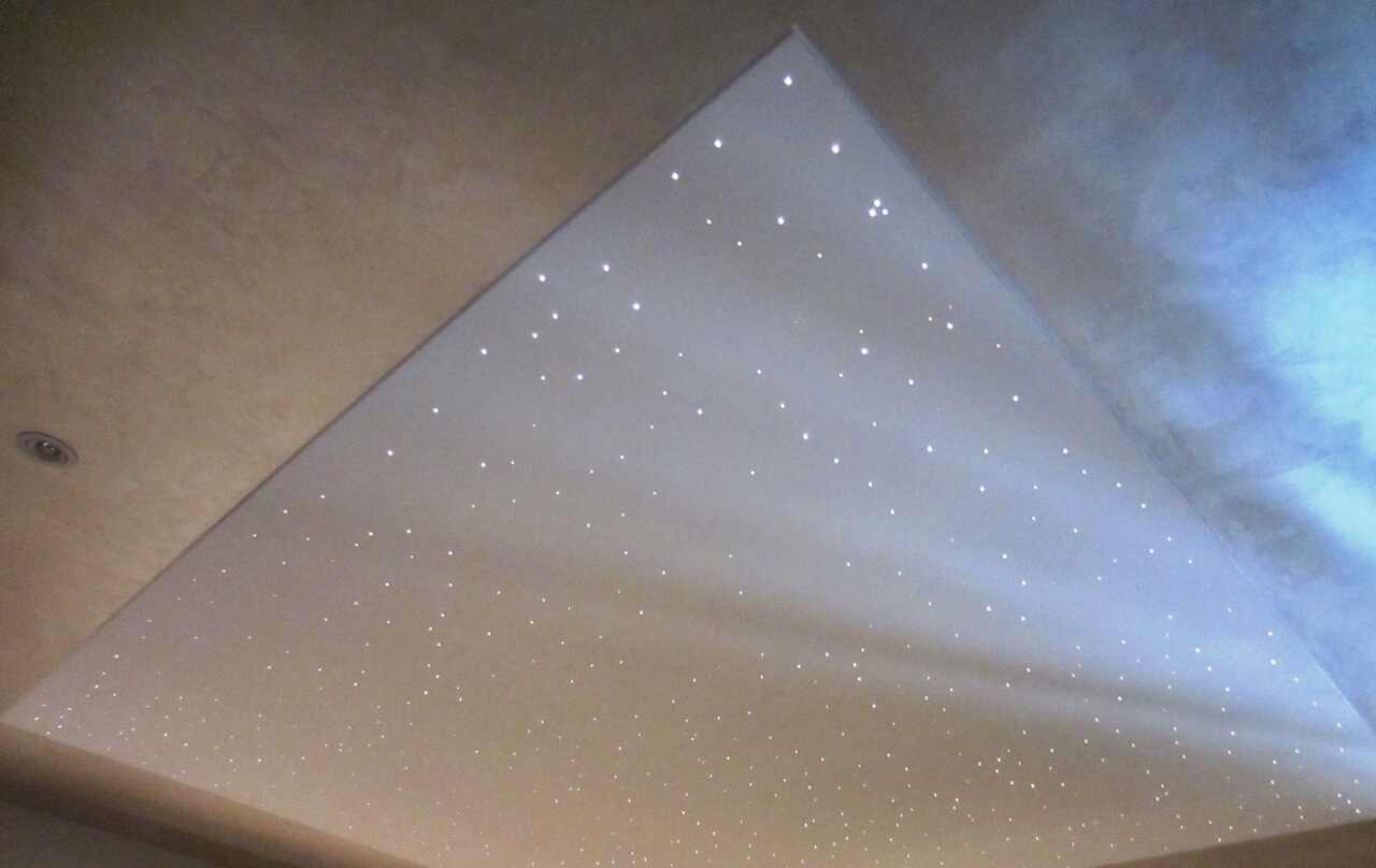
The client and his family were obsessed with horoscopes and wanted this interest to be the focal point in the space. To highlight the ceiling of the passage on the first floor, we decked it up with the galaxy ceiling concept that had cut-outs of sun signs of the family members. This way we gave an interesting twist to the space. The unique concept was moulded in its own way to set the space apart and add a creative touch here.
Were there any roadblocks you faced in the project?
The client would travel constantly and adjusting to timings suitable to his schedule was something to be taken care of. For this reason, we were not working on the entire home at a stretch. We ensured to maintain the privacy of the family while work was on as the family was staying at the residence.
Since Statuario marble was being laid on the flooring, we had to be very careful as this is a very delicate product and the entire process of laying it till its completion was a hectic task as there was other stuff lying on the floor. However we managed to fit the marble without any damage and privacy hassles.
What was the design concept used in the master bedroom?
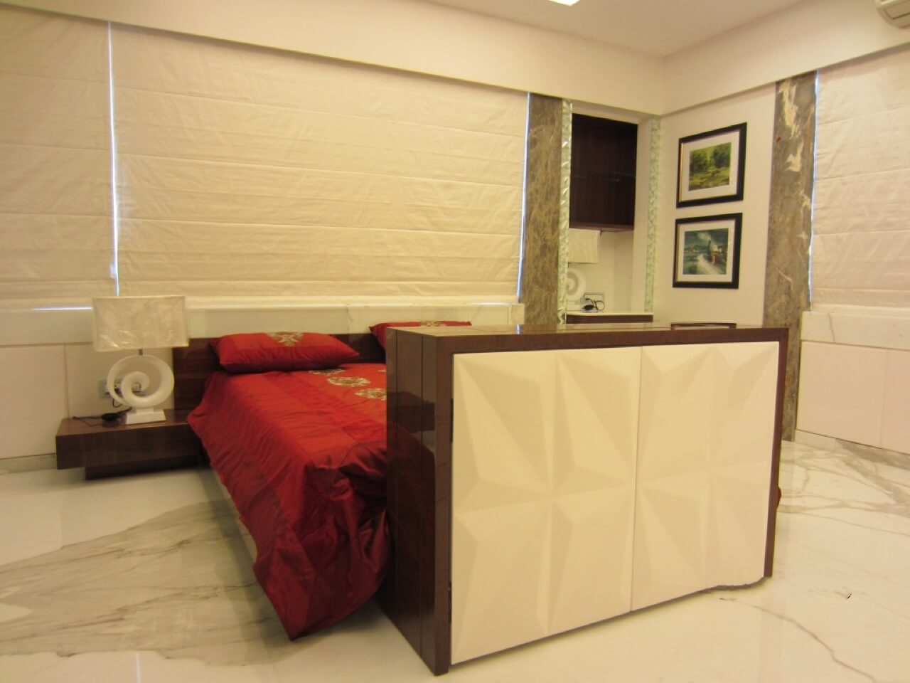
For the 250 – 300 sq. ft. master bedroom on the top floor, we continued with Statuario marble on the flooring. As the client and his family would not use the television much, it was concealed in a unit in front of the bed to form a hidden panel. This was a freestanding unit at the foot of the bed that was enhanced with a top lift function. The highlight of this unit was that it had an automated mechanism that enabled it to be visible when necessary and conceal it when not to be used. Wall to wall wardrobe in the niche completed the minimalistic look and feel of this bedroom.

