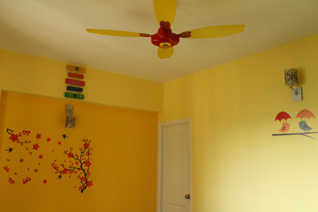
Kid’s room needs a specific kind of décor to stand out from the rest of the rooms in the house. Arrivae gives you a broader outlook on ways to use this space with expert inputs.
Client Expectation: Ashley Selwine desired a playful theme for the kid’s room.
Uniquely Yours Solution: Designed the kid’s room interiors with gender neutral colour scheme as the client was unsure of the gender of the kid.
John Moses
How did you manage to give a gender neutral design to the kid’s room?
We used a burnt orange and white colour scheme. This ensured a neutral look and feel to the space. As the client didn’t want any major design in the kid’s area, we used teak colour laminates minus any design on it.

What is the distinguishing characteristic of the project?
With an endeavour to add functional element to the space, we had a wardrobe on one side that acted as a study table. We utilized the other side of the wardrobe to create a book storage.
Could you tell us about the decorative elements used in the project?
Groove is the main highlight of the kid’s area. We have given a 1 mm groove on the bed and study table. You will find the play of grooves between the wardrobe door and upper unit (overhead storage). To add a decorative touch to the area, we have used pastel shades in the kid’s room. One of the walls was done in light mustard shade. To illuminate the space, we gave regular spotlights and wall corner lights. You will find a pastel play of colours in the entire kid’s area. For example, we have played with colours across the patti available in the room. Basic furniture like double bed and study table was also placed in the room.
What are the different features added to enhance the space?
To add a decorative touch to the kid’s area, we have highlighted the fan with the colour scheme that has been followed throughout the entire house like burnt orange and white. Keeping the demand of the client to leave ample free space for the kid to move and play around, we left the space between the wardrobe and bed open. To free up the space for the same, you will find the wardrobe connected to the study table that ends in the wardrobe. The P shape concept has been followed here. Sky tone curtains complement the kid’s area perfectly.
Did Ashley Selwine have any specific requirement to be taken care of?
The intention behind using a neutral colour scheme was to adhere to the client’s request as they were unaware of the gender of the child and didn’t desire any fancy look and feel for the space.

